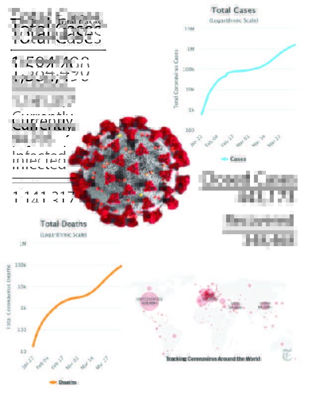
I made a infographic on the constantly changing information about the Coronavirus. I used a website called worldometer which is constantly updating its statistics on the Coronavirus. I thought it was important to include the total cases vs how many people are infected right now as well how many people have recovered and died. I also included some charts to display this information as well as a map of the world which should further help facilitate my audiences’ understanding of the virus.
